Date: August-December 2020
Roles: Graphic design for print, UI/UX design, illustration, prototyping
Software used: Figma, Adobe Photoshop
Overview
Today's teenagers spend more time online than ever before, but they might be feeling a little too at home.
We created a zine with an interactive mobile counterpart that can teach members of Gen Z about how the companies behind their favorite apps collect their personal data and all the things it could be used for without their knowledge, as well as what they can do to keep their data secure.
This was a semester-long project completed with a group of 5 other designers. Each member of the group was responsible for bringing two concepts to the table. Each concept would be translated in to a two-page spread in the zine, and a corresponding mobile interaction.
Ideation
The main goal that our group outlined was that we wanted to create something that could open a conversation on design ethics with Generation Z.
Here are some decisions we made to help stick to our goals:
- We printed a small-size zine at 6" x 9". This forced us to cut back on raw text content and find more visual ways to say what we wanted.
- The zine has an interactive mobile counterpart that brings our message in to a format our audience feels at home with.
The Name Drop Experiment
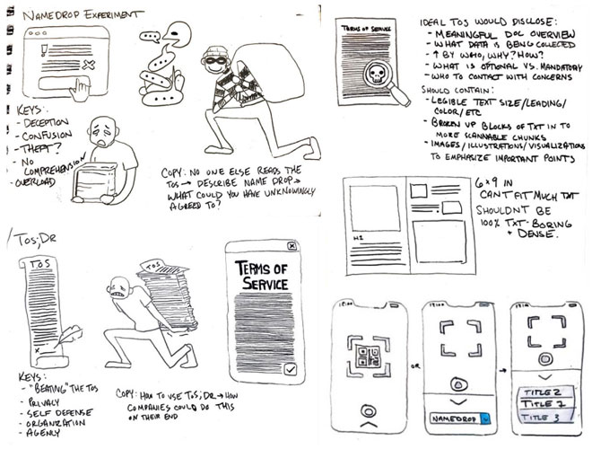
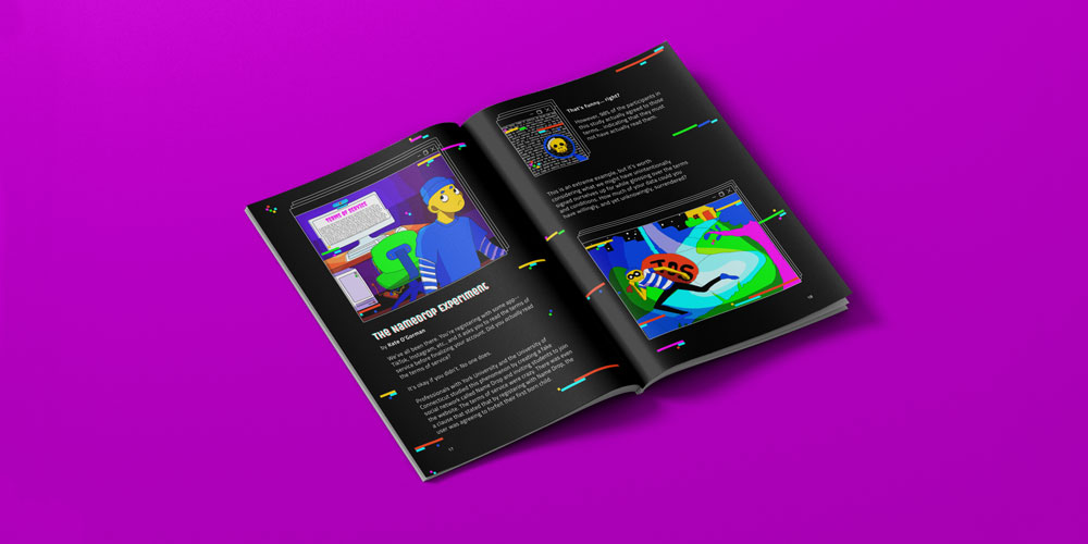
This spread describes a 2016 experiment where students were invited to join a dummy social media site known as Name Drop. The point of this study was figure out how many students on average would read the terms of service when signing up for a social media site.
The results showed that 98% of paticipants in the study agreed to the terms of service, even though they contained many rules that the average user would find objectionable. One clause even indicated that by agreeing to the terms, they were pre-emptively giving up their first born child!
This, obviously, was all in good fun, but it is a solid example of the fact that we are often agreeing to much more than we realize while mindlessly checking that box.
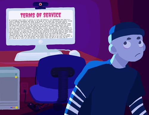

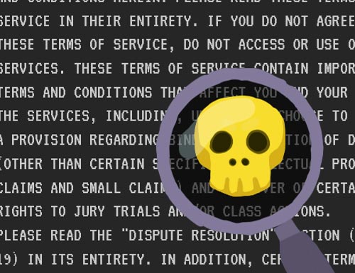
Some initial concept art for the Name Drop spread.
Mobile prototype
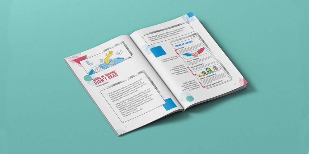
Terms of Service; Didn't Read
In this spread, I explored what we, as users, can do to more easily parse the Terms of Service (the ToS;DR browser extension comes in handy) as well as what companies could be doing to make their terms of service more user friendly.
I created a diagram that outlines some user-focused design choices one could make while drafting a ToS document, such as avoiding the use of legal jargon and including images to communicate the meaning of the text.
